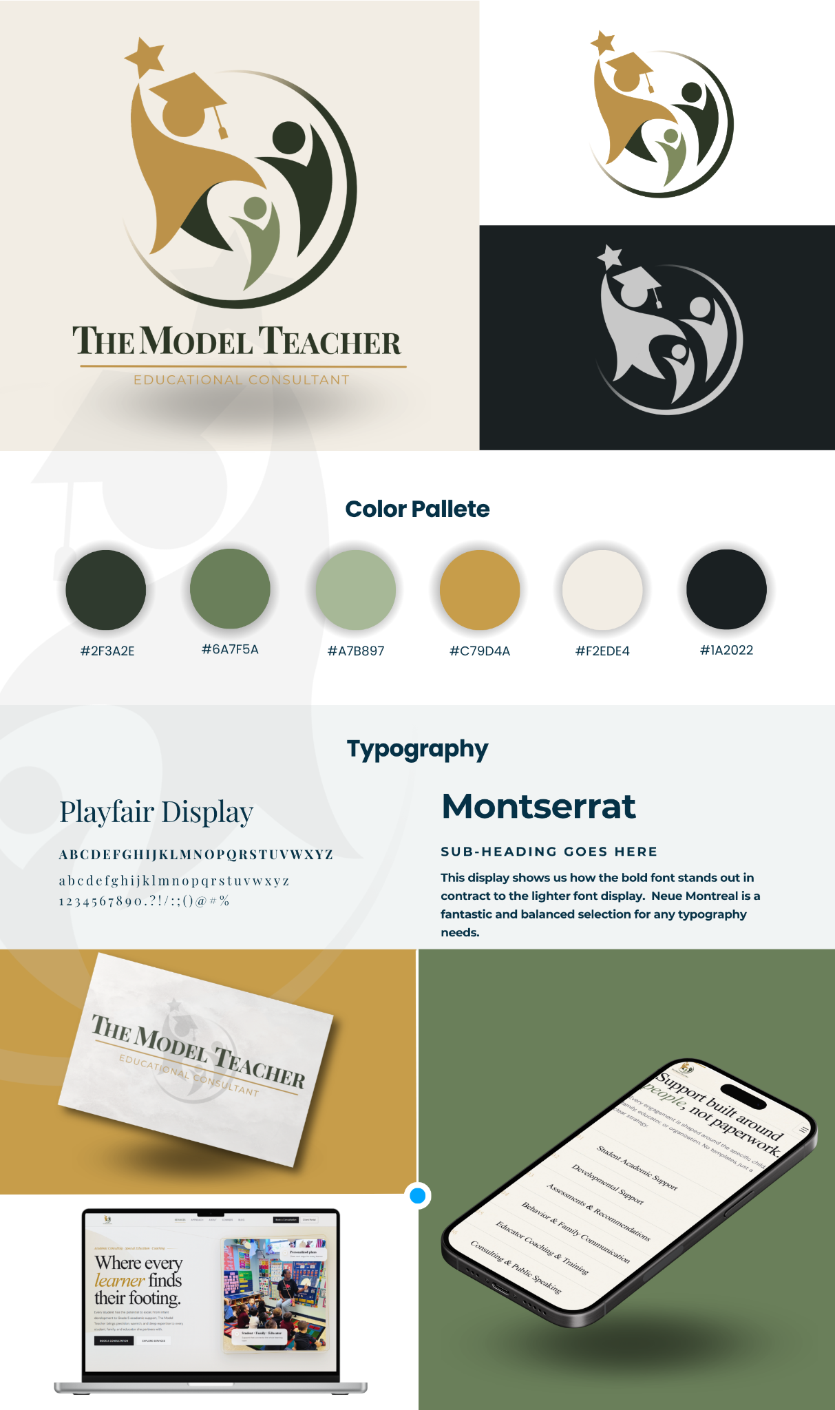
Brand board
A clean visual summary of the identity system, including the palette, typography, and application across touchpoints.
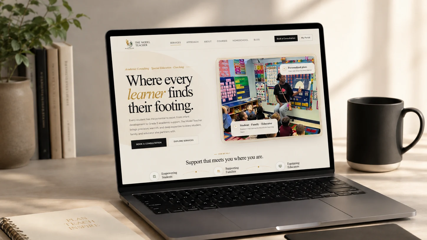
The Model Teacher needed a calm online presence that made the service easier to understand and easier to trust. The final work brought the website, brand system, and supporting print pieces into one polished first impression.
The Model Teacher already had a meaningful service. The presentation needed to feel more polished, easier to follow, and better aligned with the quality of the work itself.
The direction focused on clear messaging, warmer imagery, and a smoother path from interest to consultation.
The experience now gives visitors a clearer reason to stay. The service is easier to understand, the value feels more visible, and the next step feels more natural.
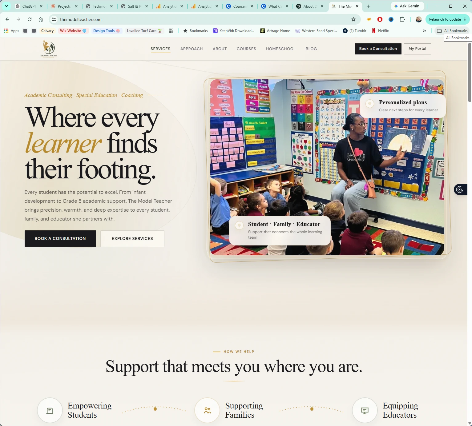
The homepage and support pages explain the offer more quickly and with more confidence.
Classroom photography and soft brand details make the site feel personal and grounded.
The identity system, print pieces, and supporting pages make the brand feel more established.
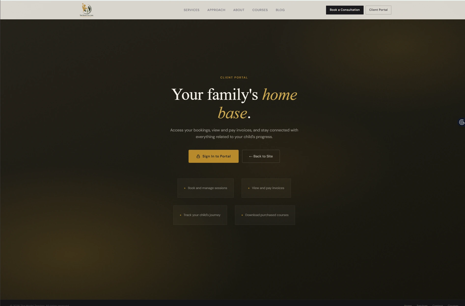
Consultation and portal paths are easier to find, making the site more useful for families.
The case study needed to show more than the homepage. The logo system, brand palette, typography, and business card all help present a fuller picture of the work.
A clean visual summary of the identity system, including the palette, typography, and application across touchpoints.
The logo uses warm gold and layered greens to feel supportive, established, and education focused.

Print pieces extend the same tone from the website into real-world materials and client touchpoints.
The brand holds together across desktop and mobile, helping the site feel consistent from first click to follow-up.
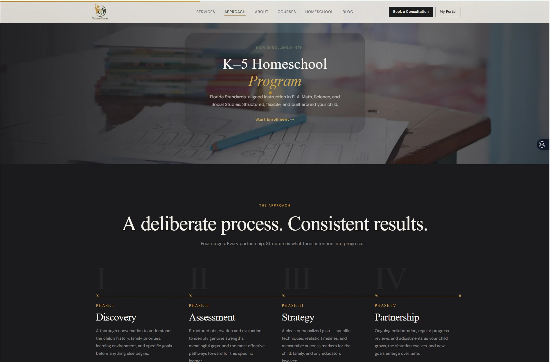
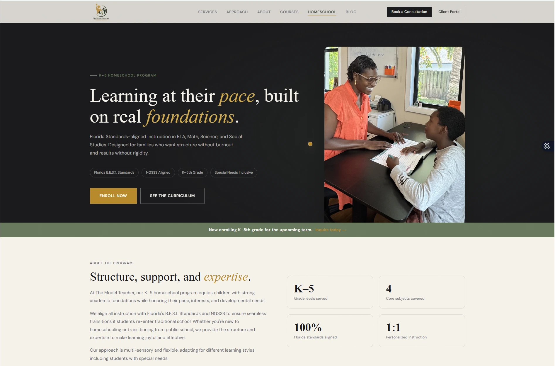
The case study now shows how the brand extends across the broader experience, not just the homepage. Supporting pages help reinforce trust and make the service feel more complete.
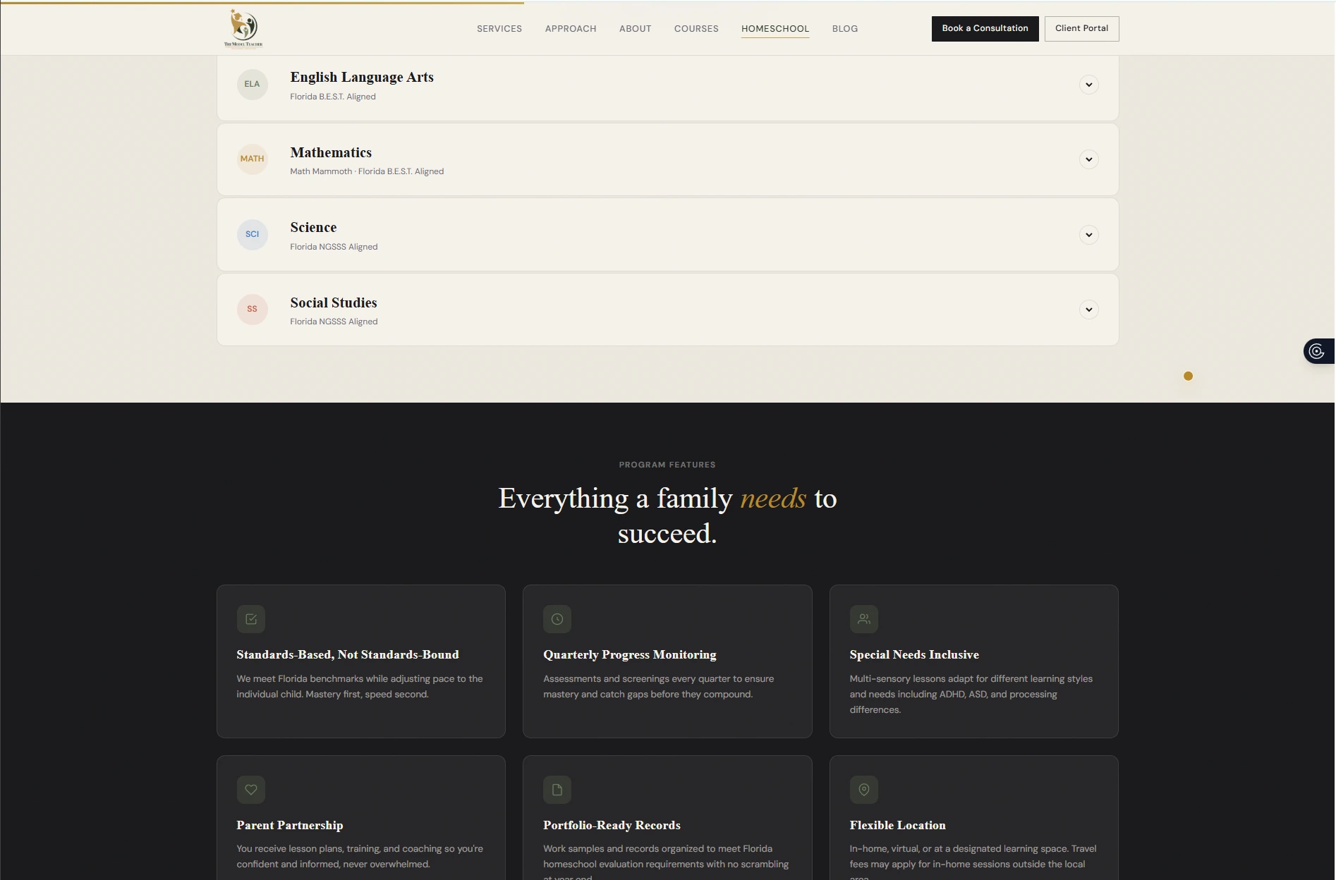
Program details are organized in a way that helps families understand the offer without feeling overloaded.
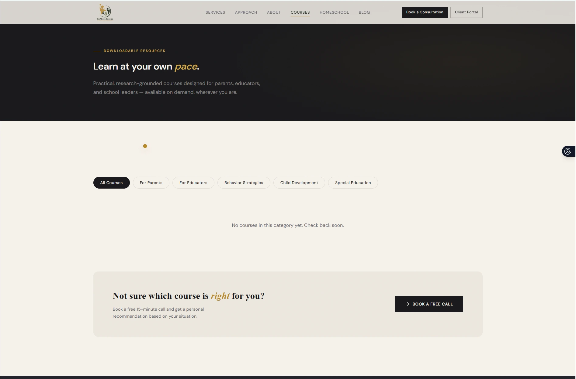
The courses page keeps the tone calm and simple while creating space for future downloadable resources.
Strong imagery and focused messaging help the homeschool offer feel practical, warm, and credible.
A dedicated portal touchpoint supports existing families while keeping the overall brand experience consistent.
The website, brand materials, and print support now feel connected. Each piece points back to the same promise: clear guidance, steady support, and a calm experience for families.
The finished system gives the brand a more complete presence across web, identity, and print.
The finished work gives The Model Teacher a polished presence that still feels personal, practical, and human.
The full presentation now feels more complete, with every touchpoint supporting the same calm and credible tone.